Perception vs. Technical Performance Data – Here’s Why and Where They Commonly Differ
This blog looks at some of the reasons why there's often a disconnect between the supply-side and demand-side views of how good IT performance is. Then offering up associated examples of what’s being missed by the sole use of traditional performance metrics and mechanisms.

This isn’t going to be the first blog you’ve read that talks to a performance, expectations, or experience gap between IT service provider performance metrics (and opinions) and the perceptions of end-users. For example, there was a Forrester Research IT service management (ITSM) blog ten years ago that highlighted a sizeable gap between what IT professionals and their business colleagues each thought of a range of IT management capabilities – with the IT view of performance exceeding that of the business for every listed IT capability. Sometimes significantly.
This and other blogs (plus reports) have called out that there’s usually a disconnect between the supply-side and demand-side views of how good IT performance is. With it often the case that IT metrics are showing that all is good (and green) in reported performance while end-users and service owners are still able to provide examples of where IT performance is adversely impacting business operations and outcomes. It’s why the term “watermelon service level agreements (SLAs)” was coined – green on the outside but red once you cut into it.
But why and where does this commonly happen in IT? To help, this blog looks at some of the reasons and offers up associated examples of what’s being missed by the sole use of traditional performance metrics and mechanisms.
Thinking differently about the “perception vs. technical data” issue
In some ways, the “perception vs. technical data” issue with IT performance can be considered similar to working in an office where the room temperature is set to 21C, and the wall thermometer says that it’s 21C, but you still feel cold. Knowing that the measurement mechanism is telling you that the office is warm enough doesn’t make you any warmer and, importantly, you know that it’s affecting your work.
Instead, you trust your body’s assessment of the temperature and put on an extra item of clothing. Because, for whatever reason, the office temperature level isn’t meeting your needs and, importantly, if unaddressed it will continue to affect your ability to work effectively. It might also become apparent that the majority of the office is now wearing extra clothes and conversations can be had around whether the 21C is high enough a room temperature or if the thermometer is faulty or incorrectly positioned to report and control the temperature for the whole office (rather than its immediate vicinity).
The bottom line is that in the same way that people are the best sensors as to whether the working temperature is appropriate (for them to work), people are also best positioned to determine whether the delivered employee experience from IT is where it needs to be or if improvements are needed.
Some of the key issues with technology-provided performance data
ITSM tools and third-party tools are usually awash with reporting capabilities, offering up a variety of metrics and key performance indicators (KPIs) that can be used to gauge how well the IT organization is performing. However, there are many issues related to the collection and use of this data and these can contribute to the gap between the reported data and the perceptions-of-IT held by end-users and service owners.
This starts with what’s collected. Just because something can be measured and reported doesn’t mean that it’s worth doing so – this might even mean that an employed metric means little to the IT organization let alone to business stakeholders. For instance, it could be that a metric measures how well IT operations are performing, whereas end-users in particular will be more interested in the outcomes that are delivered by those operations. For example, the incident resolution process might be reported as being highly efficient, but end-users are more concerned about its effectiveness and what’s achieved for them.
Not only is the “what” important here but also the “where” – that, extending this example, the IT organization is likely currently measuring the success of its incident resolution capabilities on the supply-side rather than assessing their impact at the point of demand, i.e. the end-user perspective. So, it measures process efficiency over how well end-users are actually helped by the process.
The “how” of performance measurement is important too. That the right thing might be measured in the right place but when technology assesses the performance, or even experience, it can’t be guaranteed that this reflects the end-user perception. Plus, the aggregation of such performance data might lose important issues. For example, the performance of the corporate CRM system is reported as consistently hitting (agreed) service-level targets, but deeper analysis – or questioning –would show that sales personnel in the Nordics are plagued by business-affecting use issues. Such that the technically-sourced metrics show success yet end-user perceptions, quite rightly, think otherwise.
There are, of course, other potential issues that can contribute to the gap between what IT metrics say and what business stakeholders think about IT performance but:
- Measuring the wrong things
- Focusing on operations rather than outcomes
- Measuring success where a service is created rather than where it’s consumed
- Relying on a technology view of the world
- Losing issues in the aggregation of performance data (or collecting insufficient granularity)
Are five key factors that need to be addressed to better meet business stakeholder needs and expectations of IT.
What people-based experience data will tell you
The following “disparity” examples are all pulled from our aggregate customer data (this can be freely viewed online as The Global IT Experience Benchmark H2/2021). Please note that these data insights relate to customers both old and new, i.e. organizations that have already been focused on improving the employee experience they deliver and addressing the issues that adversely impact employee productivity. As such, the aggregate data likely benefits from the experience-related improvements already made.
The key question for you when reading this section is: “Can you tell if these issues exist in your organization?” If not, then you likely cannot currently look beyond the available technical data to understand the perceptions of both end-users and service owners. Plus, the issues that our experience data is highlighting are probably both unseen and unknowingly adversely affecting your organization. Not only employee productivity but also the business operations and outcomes that rely on them.
Let’s start with what makes end-users happy with IT.
Source: HappySignals, The Global IT Experience Benchmark H1/2021
As the above graphic shows, IT support is one of the best things about IT from the end-user perspective (even if many IT organizations might still consider it as a “cost of quality” rather than a business enabler).
However, looking to the left of the graphic, this isn’t true for IT’s self-service capabilities. I’ll share more on this shortly but, in the meantime, think about what your current metrics tell you about your IT organization’s self-service capabilities. Perhaps the adoption levels are lower than expected, and desired, but is there anything else to be concerned about? What I’m pointing to is – is there potentially a disparity between what your “technology-based” metrics are telling you and what your end-users think? Importantly, is it business-critical that this disparity is known and addressed? Keep thinking about this and I’ll return to this later.
Can your technology-based measurements differentiate experience based on demographics?
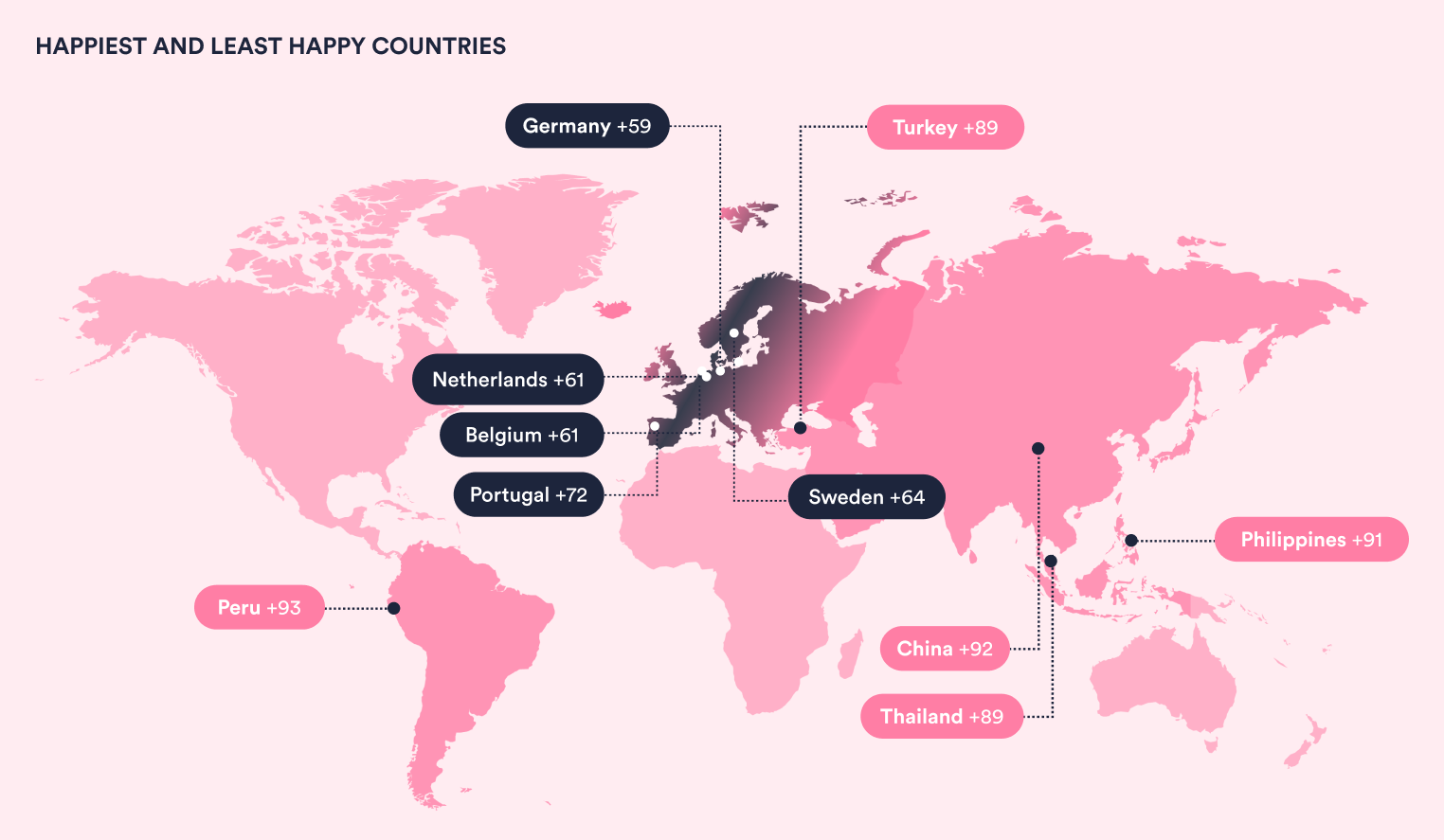
If your organization is spread across multiple continents and perhaps made up of smaller corporate entities, then does where an employee uses a device or consumes an IT service matter? Your technology-based performance capabilities will of course be able to tell you that the IT services in country X are better than country Y, but what they can’t necessarily tell you is that the end-users in country Y are happier with their IT than those in country X (such that, counterintuitively, it’s the services in the better-performing country that need to be prioritized for improvement).
The country makes a big difference to the average level of employee happiness (with IT) as shown in the graphic below.

Source: HappySignals, The Global IT Experience Benchmark H1/2021
So, continuing the above example, if the IT services in Germany (where end-user happiness is +59), say, are better than those in the Portugal (+72) according to technology-based performance measurement, which are in most need of improvement? It might be that you want to improve the happiness of Germany-located end-users but, of course, this will likely depend on accessing additional experience-based detail related to the impact on end-users and the associated business operations and outcomes.
Returning to the issues with IT self-service to articulate the end-user impact
So, our experience data shows that end-users are unhappy with self-service portals but what’s even more important is what this level of unhappiness means – in that they are unhappy for a reason (or multiple reasons). Plus, there might be a business-affecting impact that needs to be addressed too.
First, the score of 0 for self-service shown above relates to the self-service portal as a tool rather than the service experience for interactions that started in the portal. The service experience happiness level for portals is getting closer to that for telephone, say – 73 versus 79 for incidents. But, as the table below shows, the end-user perception of their lost productivity is vastly different across the two channels.
 Source: HappySignals, The Global IT Experience Benchmark H1/2021
This channel-based data shows that, on average, employees 78% more productivity when using the corporate IT self-service portal than with the telephone channel. It’s definitely not what your IT organization was expecting when it introduced its self-service capability to make IT support operations and outcomes all three of “better, faster, and cheaper.” It’s probably a key reason why the employee self-service portal adoption level, and the associated return on investment (ROI), are far lower than expected for most organizations.
Plus, it’s definitely not something that your organization wants to hear – that the IT organization is saving 8-10 minutes of IT support staff time and costs per self-service interaction while the end-user feels that they lose an extra 101 minutes of productivity (with this likely adversely affecting business operations and outcomes).
Would this insight have been achieved through technology-based performance measurement alone? There might have been a high number of self-service engagement dropouts reported but there might also have been an increase in self-service usage levels that, on the face of it, looks as though your organization is “winning with self-service.”
Consequently, the adverse business impact of the current self-service capabilities goes unnoticed and unaddressed with technology-based performance measurement. It’s only when focused, human-centric experience measurement is applied that the true state of, and issues with, self-service can be seen and improvements undertaken.
If you'd like to find out more about how human-centric experience measurement and management will help your organization to improve its operations and outcomes, then please get in touch or download a copy of our Global IT Experience Benchmark report.
Related content

23.05.2024
End-User Personas are Changing; What About Your IT Support Capabilities and Targets?
Is your IT service desk treating every end-user in the same way? If it is, it needs to understand the benefits of ...
Read more >
15.11.2023
Forget CSAT Scores, Here’s What End-Users Really Think of IT Support
IT service desks have long held customer satisfaction (CSAT) up as the independent view of their performance. After ...
Read more >

